I have very little to say about renewable energy today. For one thing, it turns out I barely understand where electricity currently comes from in the United States. Like anyone else, I can complain about coal burning power plants, but really, how much of our electricity comes from coal? Or any other common sources like natural gas or nuclear fission? Does that differ substantially across the country? No one wants to hear new ideas from the guy who doesn’t understand the old ideas.
So recently I’ve been working on catching up to speed. Here, I’ll share some analysis I did with state-level electricity generation data from the last 30 years. Considering the timescales of energy projects, that won’t paint a complete picture, but I found the results to be plenty instructive.
More specifically, this data from the U.S. Energy Information Administration (EIA) includes the electricity generation (in megawatts) split out by source in each state spanning 1990 to 2019. There are an endless number of ways to cut and view this information, which I spent plenty of time doing. Inevitably I wanted to simultaneously view too much information. So, I began working on the figures below, which have since been a convenient and efficient tool for me to better understand recent energy history in the U.S.
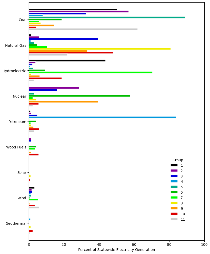
Using k-means clustering (with scikit-learn), each of the 1,530 state-years (30 years * 51 states) was grouped by its percentage breakdown in fuel sources for electricity generation. Eleven distinct clusters was found to be the sweet spot (or elbow) for the collection. Center points for each cluster are presented in Figure 1. I found clustering by within-state percentage breakdown, without further normalization, was most effective for my goals and desired observations. This choice causes the higher percentage energy sources to dominate the clustering, so while there is some cluster-to-cluster variation seen in lower percentage sources like wind, those differences are not significant. Many states have made substantial progress installing wind capacity, but further analysis is required to properly capture and distinguish that effort.
Figure 2 is the view I was ultimately looking for. All states can be quickly compared against its own history or against other states. As mentioned earlier, power plants have long life cycles, so it’s not surprising the cluster for a given state remains consistent over a period of thirty years. Aside from state-to-state differences, the nationwide shift from coal to natural gas for electricity generation stands out most clearly. Many states, such as AL, FL, and WI, that were high coal clusters in the 1990’s (1, 2, 5, 11) transition towards high natural gas clusters (3, 8, 9, 10) by later years in the chart. Even states like LA and MS that already had high proportions have natural gas have seen further increases in its fraction of their electricity generation. This Scientific American opinion article provides a quick summary of the explanations and implications of that transition, and I expect to dive more deeply into the trend myself.
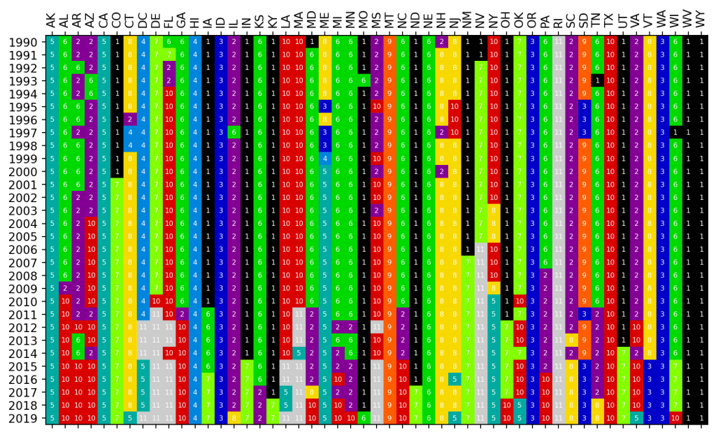
In addition to identifying overall shifts, the uniqueness of each state is also apparent. Just look at ID, OR, and WA. I had no idea hydroelectricity could provide such incredible amounts of power. I grew up in Wisconsin, and there it seems nearly every river is teeming with damns, yet at no point in the last thirty years did hydroelectricity exceed even 5% of the total generation statewide. The water moving through the Columbia River basin and the infrastructure built to capture that power are truly incredible.
Other states like VT represent our national indecision towards nuclear power. In 2014, the state decommissioned a major nuclear facility and lost an annual source of 5 million megawatt-hours of energy (70% of all energy produced in the state). That has not been replaced and the state has no doubt replaced that demand with fossil fuel from neighboring states. Even if we don’t want to depend on nuclear power in a sustainable economy, losses in low/no-carbon power like that are a huge hit. How long will it take for VT to reach 70% carbon-free energy once again? And how do the political and economic dynamics change for proponents of renewable energy in a state after such a loss? Many cluster 2, 6, or 9 states will be facing the same dilemma as their nuclear plants continue to age.
There is one last point I would like to highlight before leaving you to explore the chart yourself. During election cycles the idea of “coal country” is frequently referenced, and we’ve all seen depictions of the region in media – October Sky is the movie that comes to mind for me. I can’t begin to speak for the culture, but at least from an energy perspective, that identity is far more real than I even imagined. Classic examples like KY or WV not only generate a majority of their electricity from coal, coal provides essentially all of it. WV remains above 90% coal while KY only fell under that mark in 2015 (replaced by natural gas). Many cluster 5 (highest coal) states have already begin the shift away from coal, but others like WV and WY have not made any substantial changes and will face serious reckoning if more aggressive moves are made to end coal in the United States.
As a last point, I hoped to view these clusters from a value perspective, and GDP is a natural catchall for that sort of analysis. In Figure 3, the annual GDP growth rate was calculated for each state-year, the national growth rate was subtracted from that value, then those relative growth rates were averaged by cluster. All that produces the figure below. 95% confidence intervals of the distributions are represented as error bars with several clusters implying significant positive or negative means. Yes, this is not the most rigorous chart. I’m still learning how to properly capture economic data and identify truly significant trends, but it’s still an interesting first look.
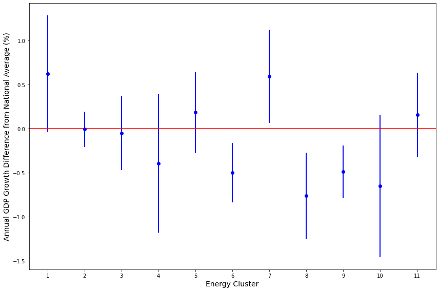
There are three observations that I absolutely want to understand further. First, states in the two highest hydroelectric clusters, 1 and 7, appear to perform best relative to the rest of the country. As hydroelectricity is the largest sustainable energy source currently available in the U.S., I’d like to argue this is a point in favor of expanding technologies such as solar or wind. It does seem a natural assumption that passively collecting energy without ongoing mining, drilling, shipping, etc. would lead to more efficient transfer of electricity into economic value, though again, far more work is needed on my part to convincingly make or refute that point.
The second observation is the below average performance of clusters 8 and 10 which represent the highest natural gas proportions. Ignoring environmental factors, is the shift from coal to natural gas hurting states economically? Is there something about the capital investment or distribution infrastructure that causes natural gas to be more of a Trojan horse for states? Or did the timing of transitions toward natural gas coincide with unrelated headwinds for economic growth in those state-years?
Lastly, 6 and 9 are the highest nuclear clusters and are also perform below average. From my layman’s perspective, it would seem the expense to maintain aging facilities and incredible costs and oversight related to handling nuclear fuel throughout its life cycle explain the inefficiency. These are only guesses that require much more study, but if the trend is indeed real, further development of nuclear power must absolutely address these concerns while maintaining a high level of safety and security.
I found this energy dataset to be a fascinating look at the variety in energy across the country. Too often I begin from the assumption that our economy is developed enough to neutralize local differences in politics, geography, or natural resources in the delivery of something as basic as electricity. Clearly that is not the case. No state generates nearly enough power from renewables, but the path to getting there will not be the same for each. Might there be eleven such paths?
—-
Data Sources:
Electricity generation data by state was provided by the U.S. Energy Information Administration (EIA) and accessed: https://www.eia.gov/electricity/data/state/
State GDP data was provided by the U.S. Bureau of Economic Analysis (BEA) and accessed: https://www.bea.gov/data/gdp/gdp-state
